
How to create key-value list using Subgrid
August 29, 2026This post explains why traditional CSS Grid is not enough for key-value lists and how to use subgrid to create a perfect key-value list.
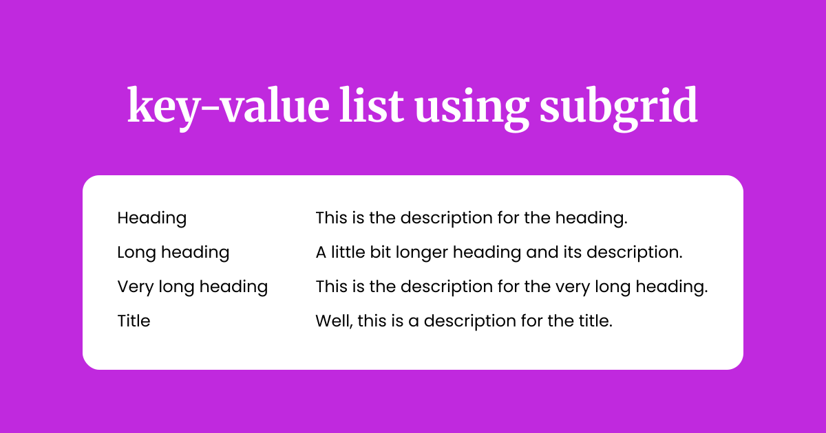
Creating a key-value list in CSS is a surprisingly challenging task when it comes to layout flexibility.
The Challenge
Let's say we want to build a key-value list like this:
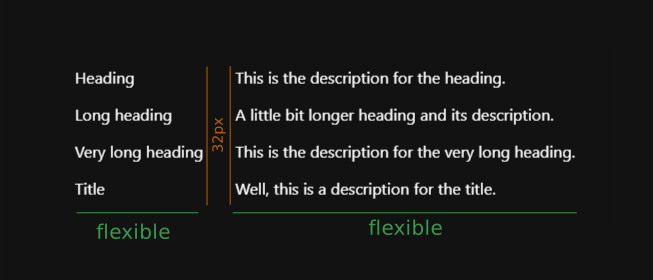
The core challenge here is the the gap between the longest heading and its description needs to stay fixed per the design, while the descriptions themselves need to align automatically based on heading length.
Can We Build It with Regular Grid?
Yes, but it won't stay flexible as heading lengths change. You might try something like this:
HTML
<dl class="list">
  <div class="item">
    <dt>Heading</dt>
    <dd>This is the description for the heading.</dd>
  </div>

  <div class="item">
    <dt>Long heading</dt>
    <dd>A little bit longer heading and its description.</dd>
  </div>

  <div class="item">
    <dt>Very long heading</dt>
    <dd>This is the description for the very long heading.</dd>
  </div>

  <div class="item">
    <dt>Title</dt>
    <dd>Well, this is a description for the title.</dd>
  </div>
</dl>
Accessibility tip: We're using<dl>,<dt>, and<dd>here instead of generic<div>s. A key-value list is exactly what description lists were designed for.
CSS
.item {
  display: grid;
  grid-template-columns: 150px 1fr;
  gap: 2rem;
}
Result

At first glance, this looks like it solves the problem: 150px for the heading column, done.
But that fixed 150px is exactly the problem.
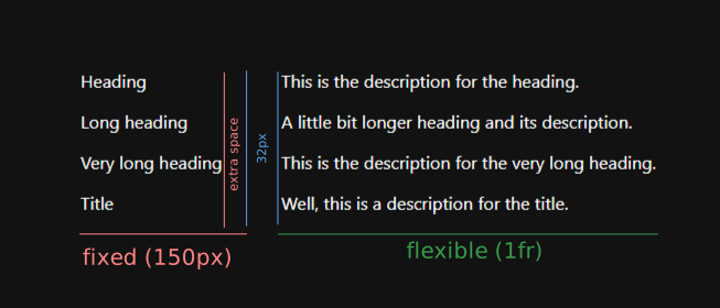
In the real world, headings are rarely a predictable length, especially when content comes from a dynamic source like a CMS or API. If your headings turn out shorter than expected:
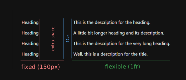
You end up with an awkwardly large horizontal gap.
And if they're longer than expected:
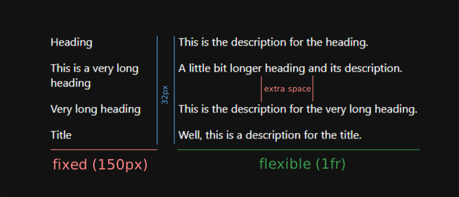
They wrap, and you get inconsistent vertical spacing between items.
Because each .item defines its own grid independently, there's no way for column widths to stay in sync across the whole list.
That's the piece regular grid can't give us.
The Fix: CSS Subgrid
CSS subgrid lets a child element inherit the grid track definitions from its parent, instead of defining its own from scratch.
We can declare the column layout once on the parent .list, and have every .item plug into that same layout.
.list {
  display: grid;
  grid-template-columns: max-content 1fr;
  gap: 1rem; /* vertical gap between items */
}

.item {
  grid-column: 1 / -1;

  display: grid;
  grid-template-columns: subgrid;
  gap: 2rem; /* horizontal gap between heading & description */
}
Here's what's happening:
- On
.list, we declare a two-column layout:max-contentfor the first column and1frfor the second.max-contentsizes the heading column to fit its widest content without wrapping;1frlets the description take up the rest. - Each
.itemis set to span the full grid withgrid-column: 1 / -1. - Setting
display: gridandgrid-template-columns: subgridon.itemtells it to inherit the exact column tracks from.list, rather than creating new ones.
This is also where that .item wrapper <div> earns its keep. Without subgrid, wrapping each <dt>/<dd> pair in a <div> would break any attempt at column alignment, since the browser would treat each wrapper as its own isolated grid. Subgrid is what lets us keep the wrapper (and its markup benefits) while still getting everything to line up.
The result
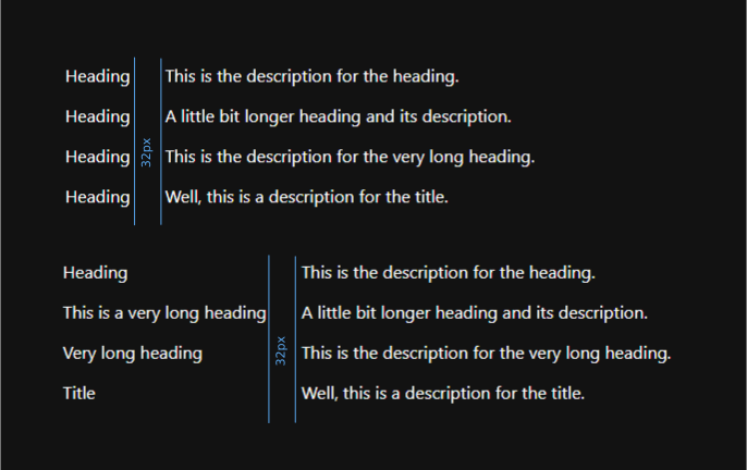
Every heading gets sized to fit the widest heading in the list, and every description lines up in the second column, automatically. If any heading grows or shrinks, the entire layout adjusts on its own. No fixed pixel values, no guesswork.
Common Pitfalls
One common mistake is wrapping the child items in "div hell": multiple layers of nested wrapper elements.
<dl class="list">
  <div class="item">
    <div class="content">
      <dt>Heading</dt>
      <dd>This is the description for the heading.</dd>
    </div>
  </div>

  <div class="item">
    <div class="content">
      <dt>This is a very long heading</dt>
      <dd>A little bit longer heading and its description.</dd>
    </div>
  </div>
</dl>
If you do this, you'll need to declare subgrid at every layer for the alignment to pass through, since a child only inherits its direct parent's grid tracks. Each additional nesting level means another display: grid; grid-template-columns: subgrid; declaration, which gets messy fast and isn't the right approach semantically either.
But What If the Heading Comes Way Too Long?

To handle this edge case, you can set a max-width on the <dt> element (or whatever your heading element is):
dt {
  max-width: 40ch;
}
Since the heading column is sized with max-content, an unusually long heading, like a long product name or a dynamic string, could stretch the column further than your design intends.
Capping max-width on <dt> puts a ceiling on that column's growth, so instead of the heading column expanding indefinitely, the text wraps once it hits the limit.
You'll likely want to pair this with a word-breaking rule, in case a single long word (like a URL or an unbroken string) would otherwise overflow the fixed width:
dt {
  max-width: 40ch;
  overflow-wrap: break-word;
}
This gives you the best of both: the column still grows naturally to fit shorter headings via max-content, but never beyond a sensible limit.
Browser Support
Subgrid is supported in all major modern browsers: Chrome, Edge, Firefox, and Safari all ship it today. If you need to support older browser versions, check current numbers on caniuse.com/css-subgrid before relying on it in production, and consider a fallback (like the fixed-column approach above) for unsupported browsers.
Live Demo
See the Pen Key value list using subgrid by heygauravshukla (@heygauravshukla) on CodePen.
Final Thoughts
This key-value list is just one common example, subgrid turns out to be useful anywhere nested elements need to line up across a shared set of tracks.
Happy coding!